
When Wine Became Art — Mayes Wine Crush

Overview
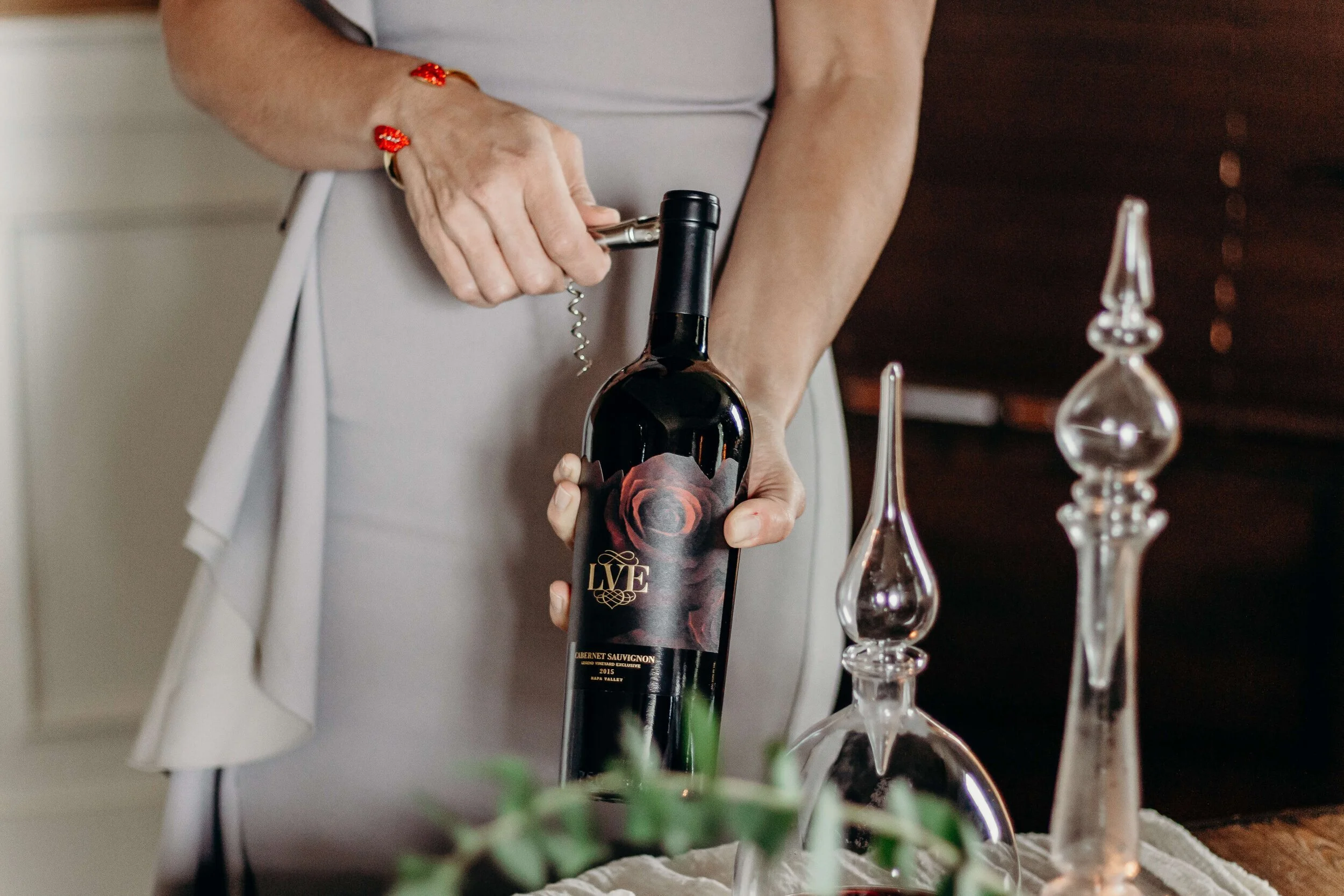
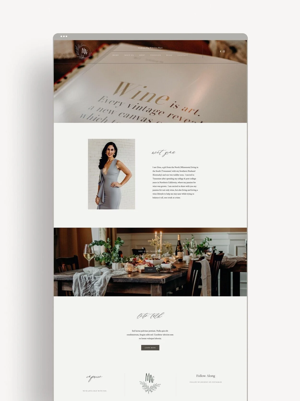
Mayes Wine Crush came to market with a product worth talking about and nothing yet built to say it. A launch brand needs more than a logo — it needs a world for the product to live in before the first bottle ever ships. I led creative direction across the full launch: set design, photography direction and shot list, brand identity, and website — building the visual language from the ground up rather than layering it onto something that already existed.
The Challenge
"When a product launches with no brand behind it, even great wine gets lost on the shelf."
There was no existing identity, no photography, no site — just a product and a point of view worth building around. The challenge wasn't fixing a broken brand; it was deciding, from zero, what Mayes Wine Crush should look, feel, and read like before a single customer ever encountered it.
The Outcome
Mayes Wine Crush launched with a fully realized brand, an award-winning, publication-featured editorial shoot, and a wave of early interest that carried into years of continued success — proof that the art-first positioning was the right call from day one.
The Process
-
With no existing brand to react to, direction started with the product itself — what made this wine worth noticing, and who it was for. The answer pointed toward an audience that wanted craft and story, not just a label.
-
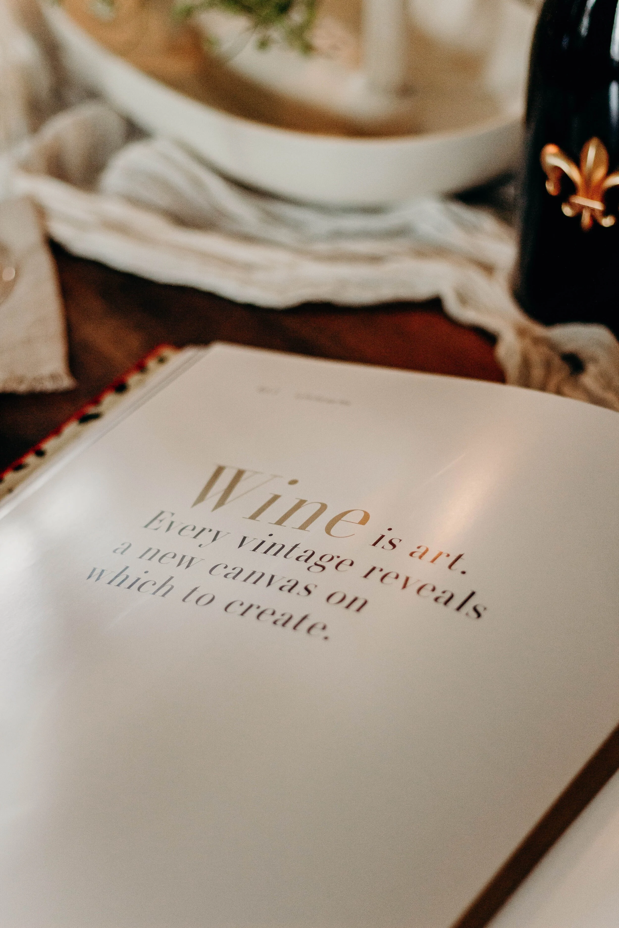
The decisive move: position the wine as art, not commodity. Every downstream decision — the set design, the photography style, the identity, the site — was built to reinforce that a bottle of Mayes Wine Crush is a creative object, not a grocery-aisle purchase.
-
I directed the full photo shoot from concept through execution — set design, styling, shot list, and on-set direction — to produce editorial-quality imagery built around warmth, texture, and craft rather than standard product photography. That imagery became the foundation for the brand identity and the website, both designed to feel like a styled editorial feature rather than a typical e-commerce launch.
-
The identity, photography, and website were refined together as one cohesive system, so the brand felt fully formed at launch rather than assembled from disconnected pieces.