I Ran 40 of My Own Graphics Through My Composition Check
Eight Squarespace add-ons, five sizes each, forty graphics. Before posting them, I ran every one through my own Composition Check. No single design was the problem. Consistency was. Here’s what it caught and what I’m changing.
Composition Check · 40 graphics · 5 sizes
I make a promo graphic for every Squarespace add-on I build. Eight add-ons, five sizes each, forty graphics. Before posting them, I ran every single one through my own Composition Check. Here is what it caught, and what I am changing.
The short version: no single design was the problem. Consistency was. When you resize one design five ways, small decisions drift. A card changes color. A gap disappears. A button slides under Instagram's reply bar. One at a time, you would never notice. Side by side, it shows.
The scores
| Size | Average of 9 | Range |
|---|---|---|
| Landscape 16:10 | 6.5 | 4 to 8 |
| Square 1:1 | 7.8 | 7 to 8 |
| Pin 2:3 | 7.2 | 7 to 8 |
| Long pin 1:2.1 | 6.9 | 6 to 7 |
| Story 9:16 | 7.0 | 6 to 8 |
What I am fixing
Two landscapes drifted off the system
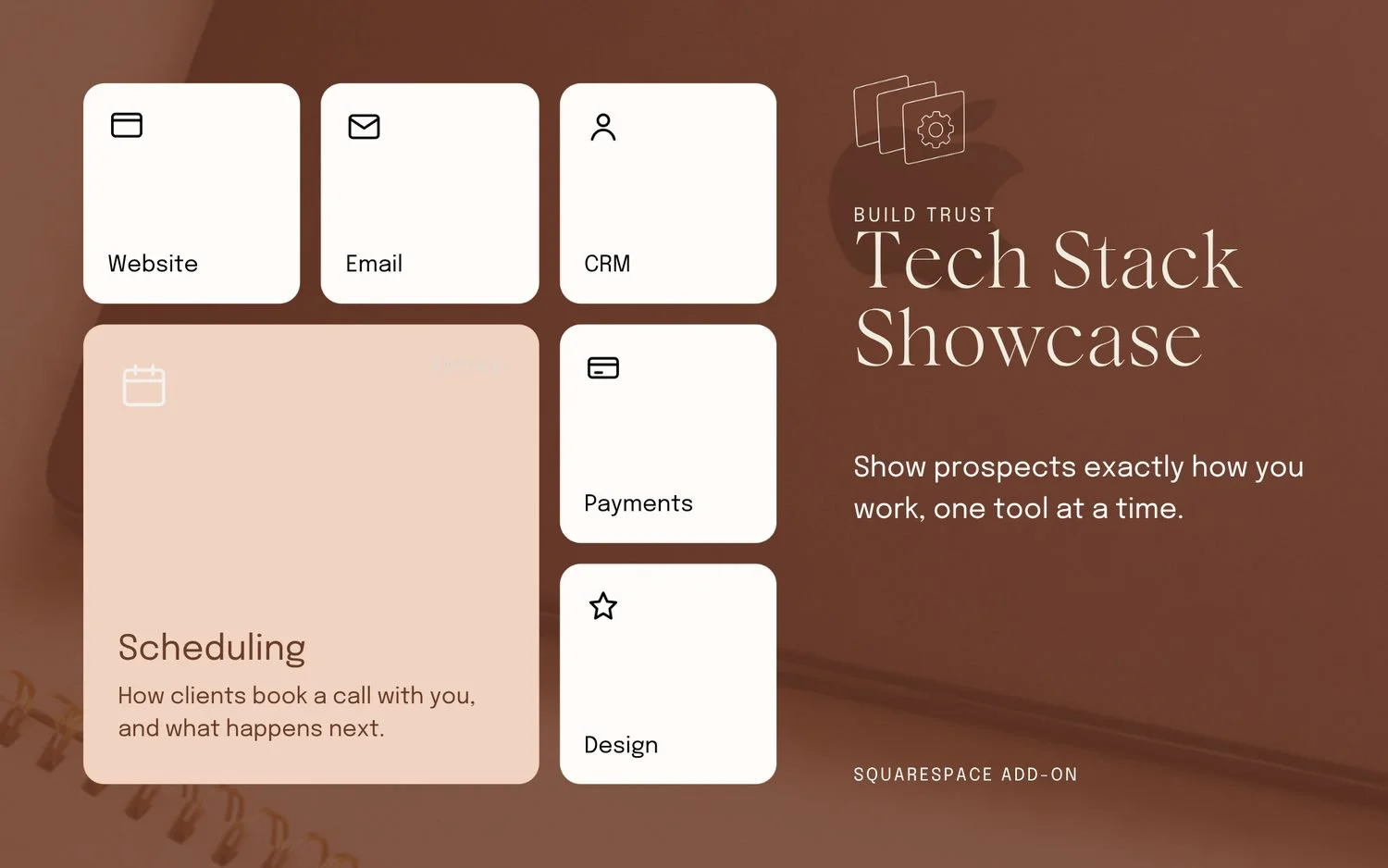
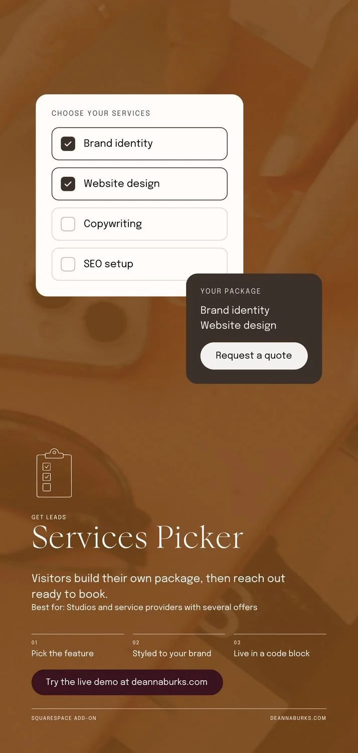
In #3 the Scheduling card went pale peach, and its icon and label nearly vanished. In #6 the package card ended up brown text on tan, at a contrast of 3.1 to 1. That is the one real readability fail in the set. Every other size uses dark cards with light text, so these two are going back in line.
The story buttons sit under Instagram's reply bar
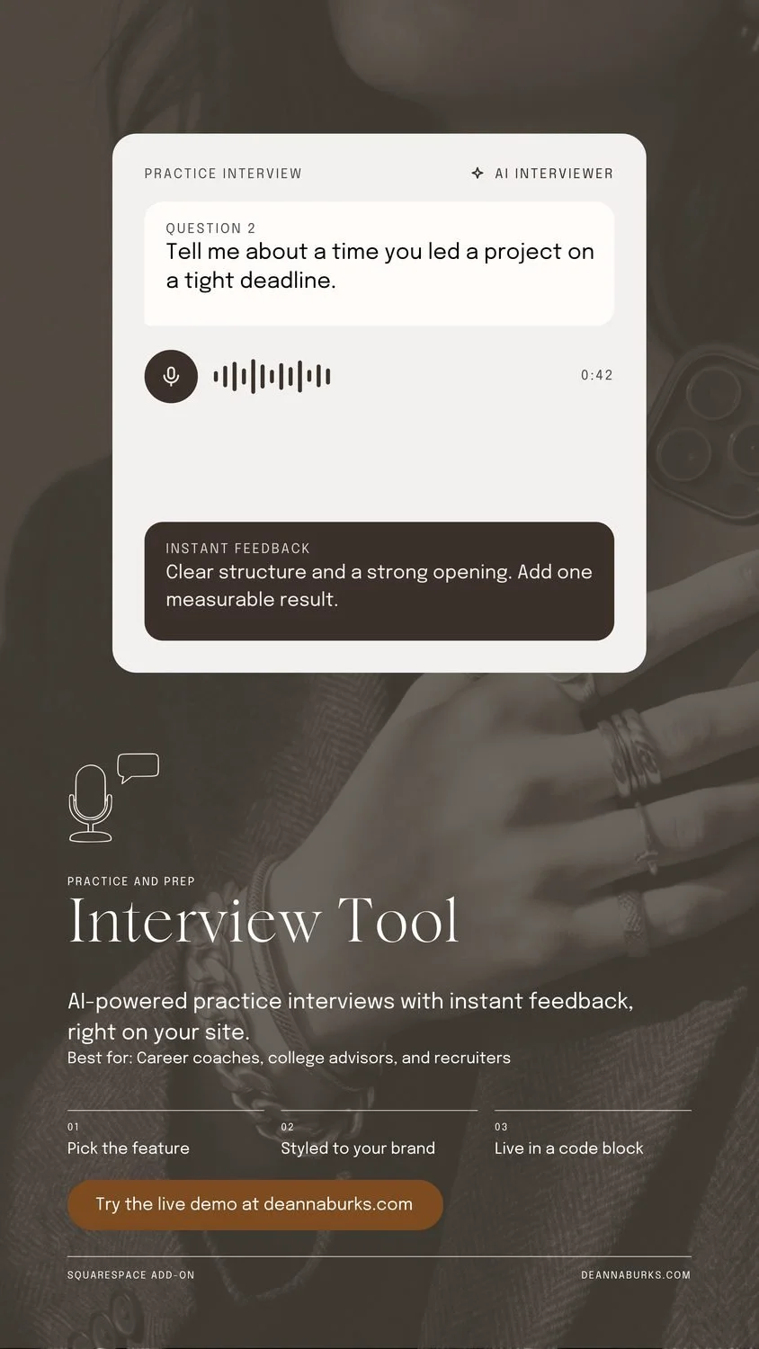
On all eight stories, the Try the live demo button sits 87 to 91 percent of the way down. That is exactly the strip Instagram covers with its reply bar. I am moving it up to about 80 percent and keeping the top 14 percent clear for the profile name, too.
Spacing slipped on the tall formats
On most long pins and stories, the Best for line touches the body copy with no gap. On a few others there is a gap. Same template, different spacing. Nobody would name it, but everyone would feel it.
The long pins have a dead zone in the middle
The mockup ends about halfway down, and the text does not start until about 60 percent. On one pin, that empty band is a fifth of the design. Pinterest also favors 2:3 and can cut taller pins off in the feed, which would hide my titles. The 2:3 pins will lead.
Too many text sizes
The tall formats use five or six text sizes. Eyebrow, title, body, Best for, step numbers, step labels, button, footer. Setting the small supporting lines at one size brings it down to four, and the bottom of each design gets calmer.
The landscapes are missing my URL
Every other size carries deannaburks.com. The landscapes do not. Easy fix, and an important one, since these are the graphics most likely to get shared without context.
Lonely last words
Six body lines end with one word sitting alone: book, live, enjoy, time. Designers call these widows. A small copy tweak or a narrower text box fixes each one.
How to read the flags on your own designs
A check is a second set of eyes, not a judge. Some flags are worth acting on every time. Others depend on what you meant to do. Here is how I sorted mine.
Trust the readability flags
The contrast numbers are measured on your actual text. Small text on a photo is where most designs slip, mine included.
Trust the text size count
Four sizes is plenty for most graphics. More than that and nothing feels like the headline.
Weigh "very full" on photos
Photo texture counts as filled space. It matters when busy detail sits right behind your words. Otherwise, it is the photo doing its job.
Weigh position on tall formats
My pins and stories put the mockup on top and the text below on purpose. A position flag there is expected. If the layout is a choice, keep it.
Every graphic, one by one
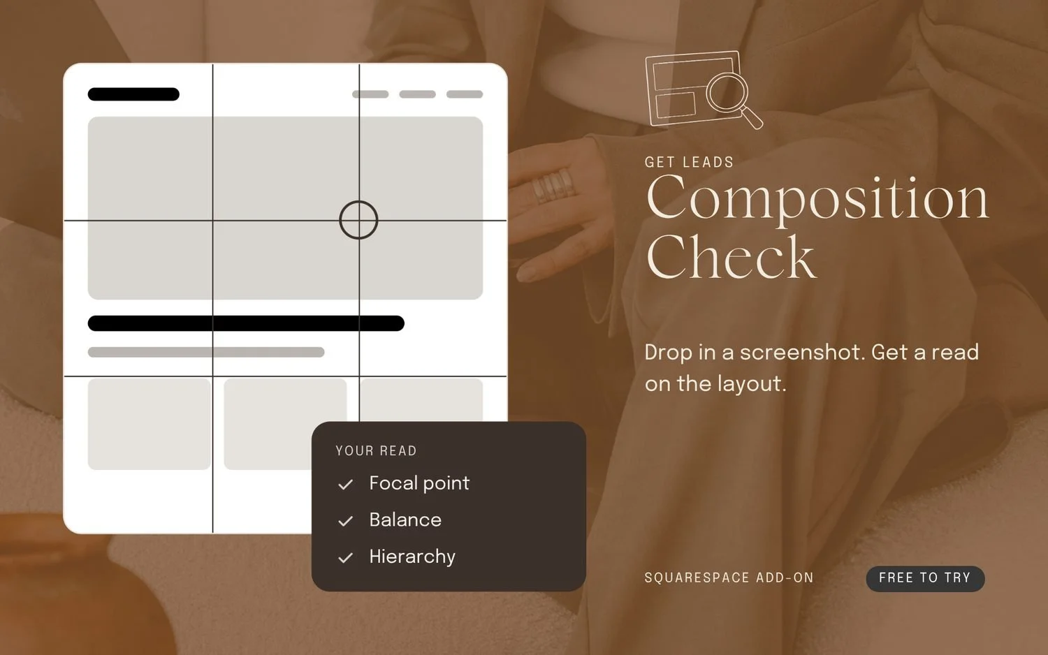
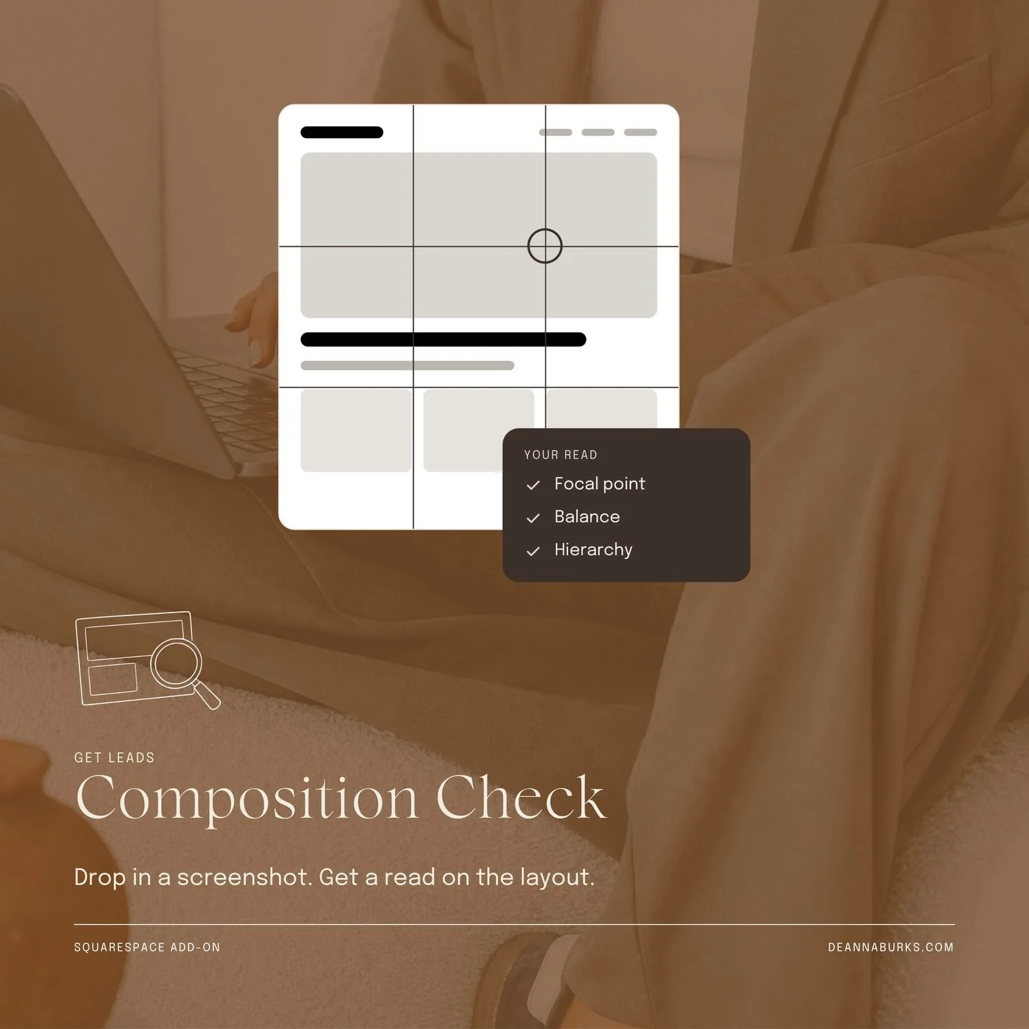
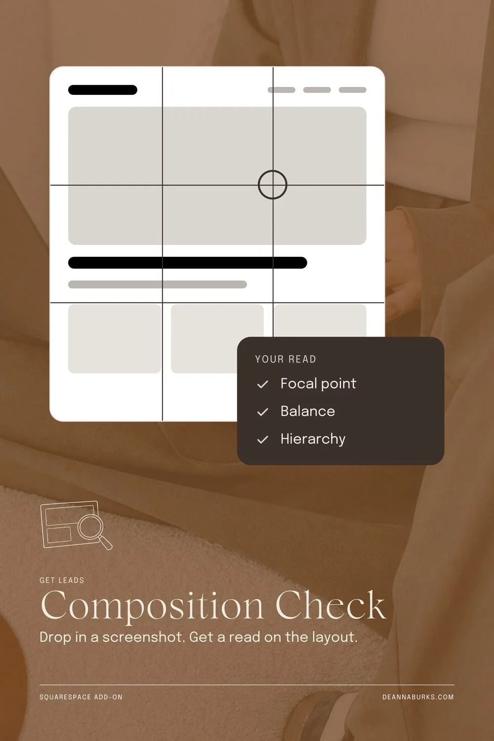
Composition Check
8/9- Position the left, halfway down
My strongest landscape. It is also the only one with a Free to try pill, and none of the landscapes show my URL. So the set does not match yet.
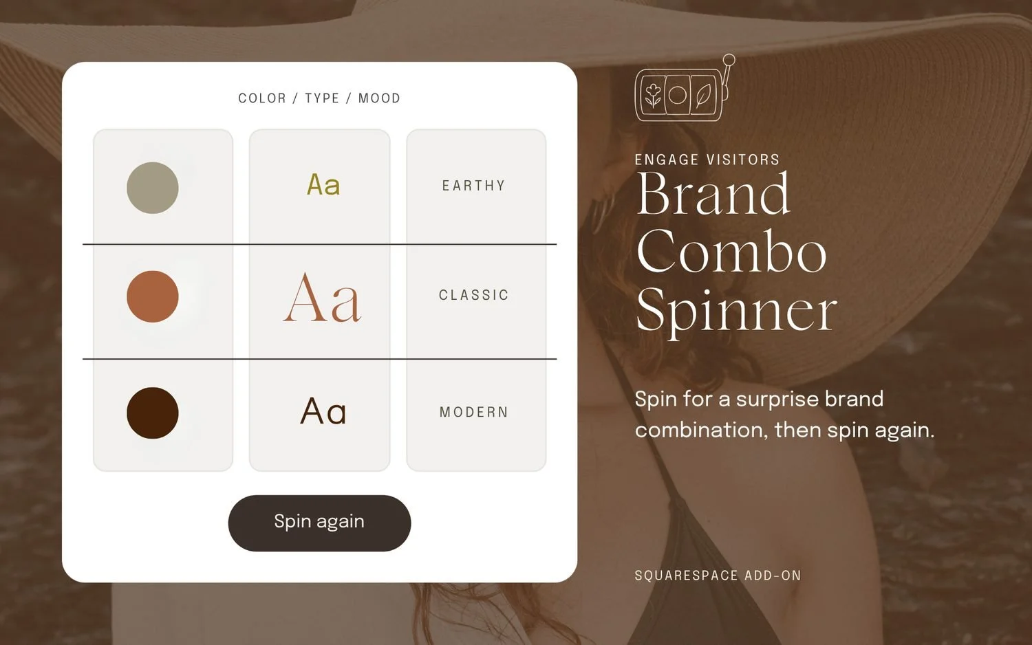
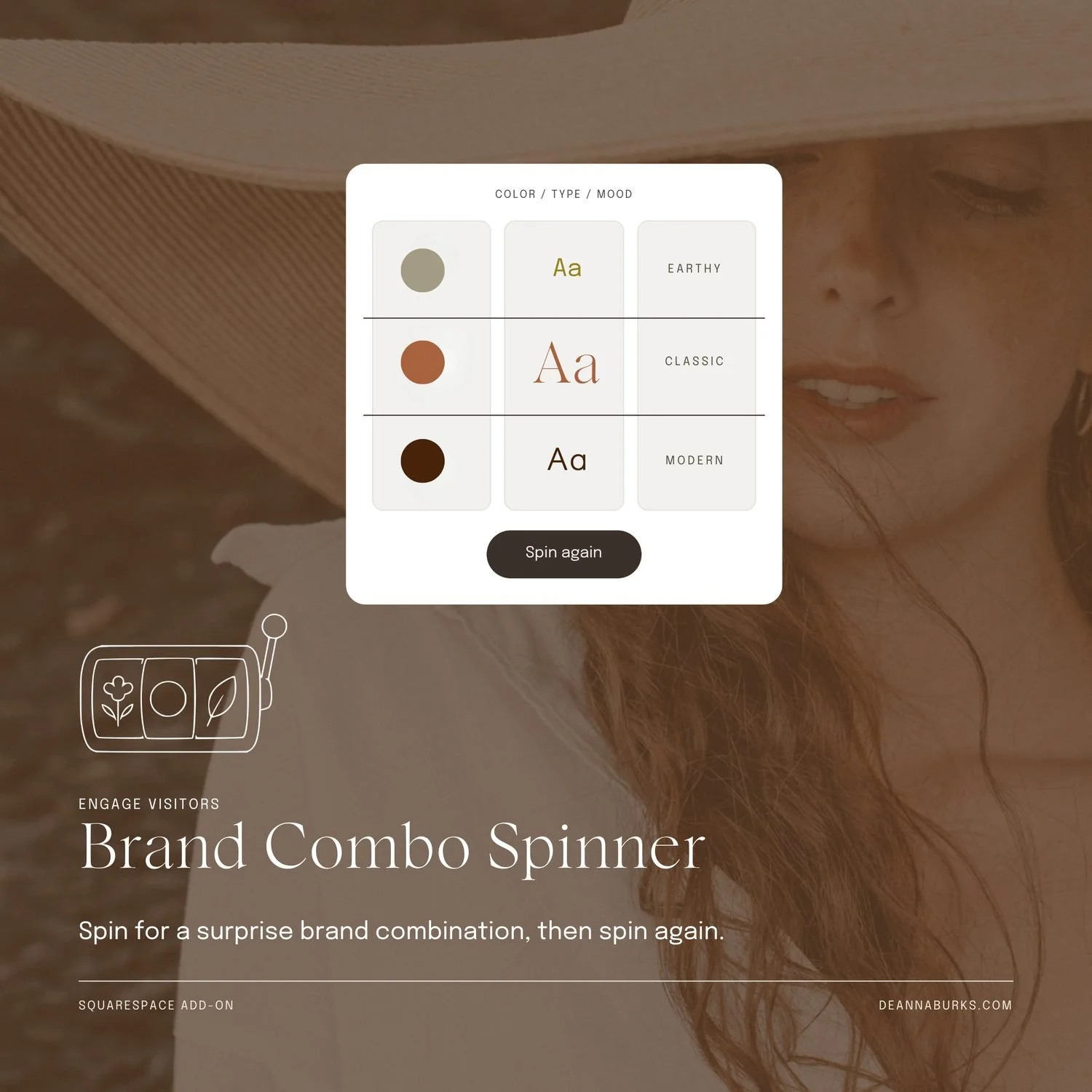
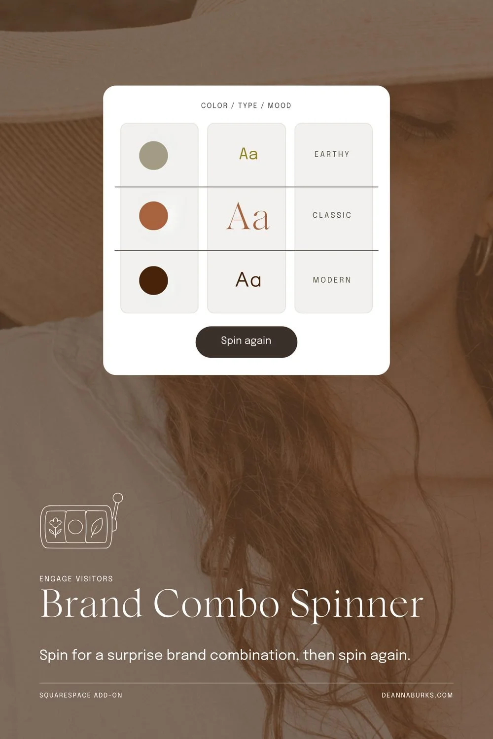
Brand Combo Spinner
4/9- Position the left, halfway down
- Balance split down the middle
- Empty Space very full
- Readability large text only
- Text Sizes headline too close
The lowest score in the set. The card and the headline each take exactly half the frame, so nothing leads. I am shrinking the card and setting the title on two lines.
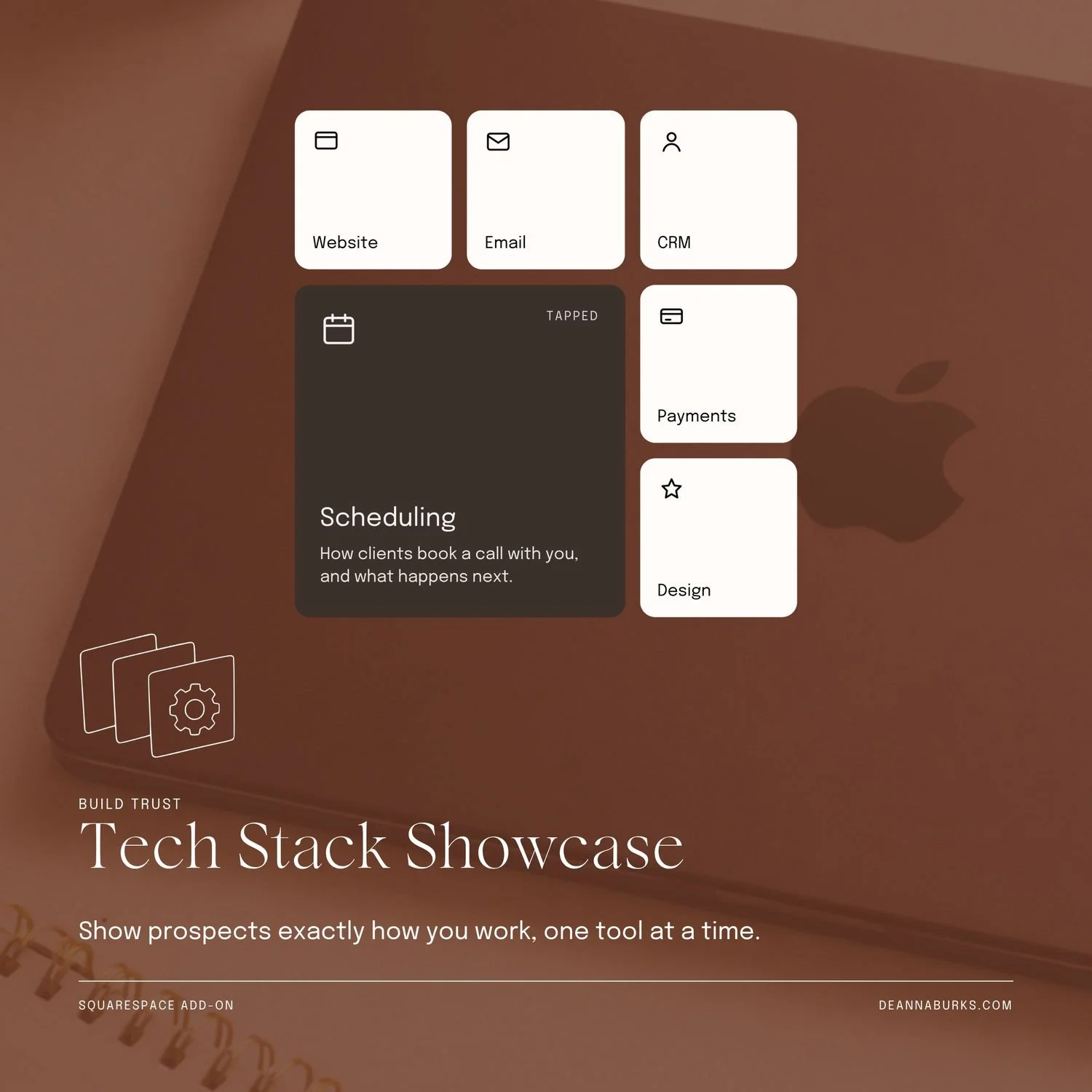
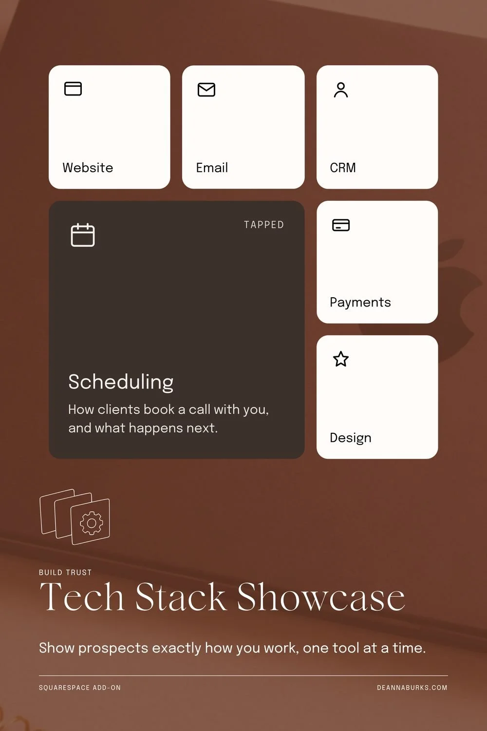
Tech Stack Showcase
7/9- Balance split down the middle
- Empty Space very full
The Scheduling card went pale peach here. It is dark in every other size. On peach, its icon and label nearly disappear.
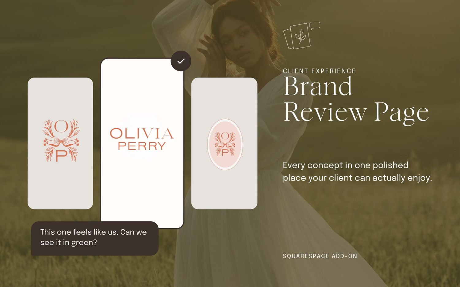
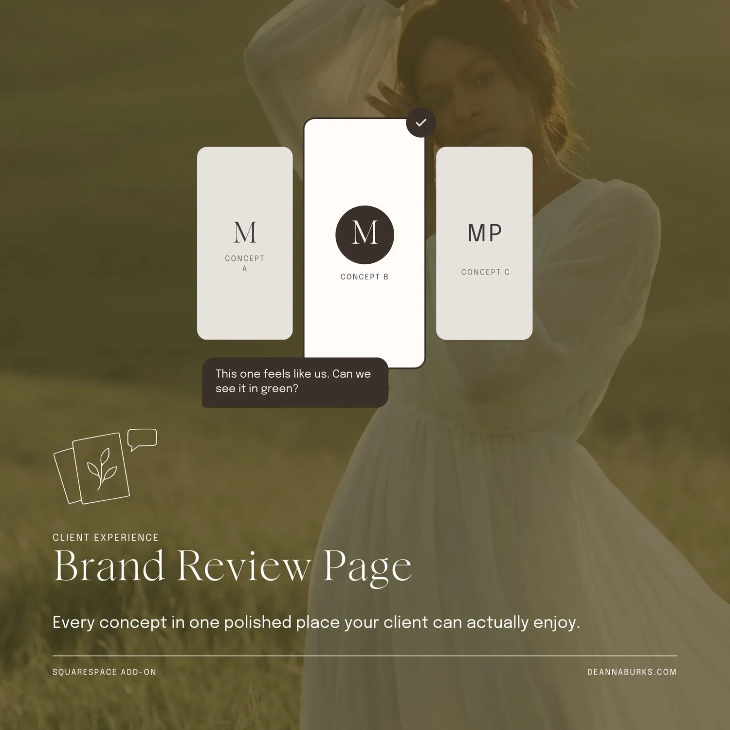
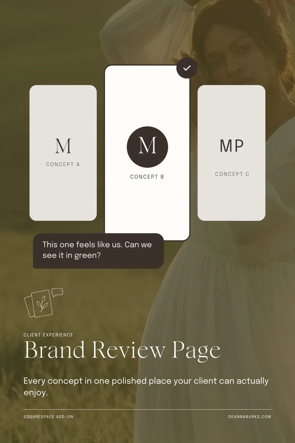
Brand Review Page
6/9- Position the left, halfway down
- Empty Space very full
- First Screen thin up top
The model's face lands right between the cards and the headline, so it competes with both. A new photo crop puts her behind the cards.
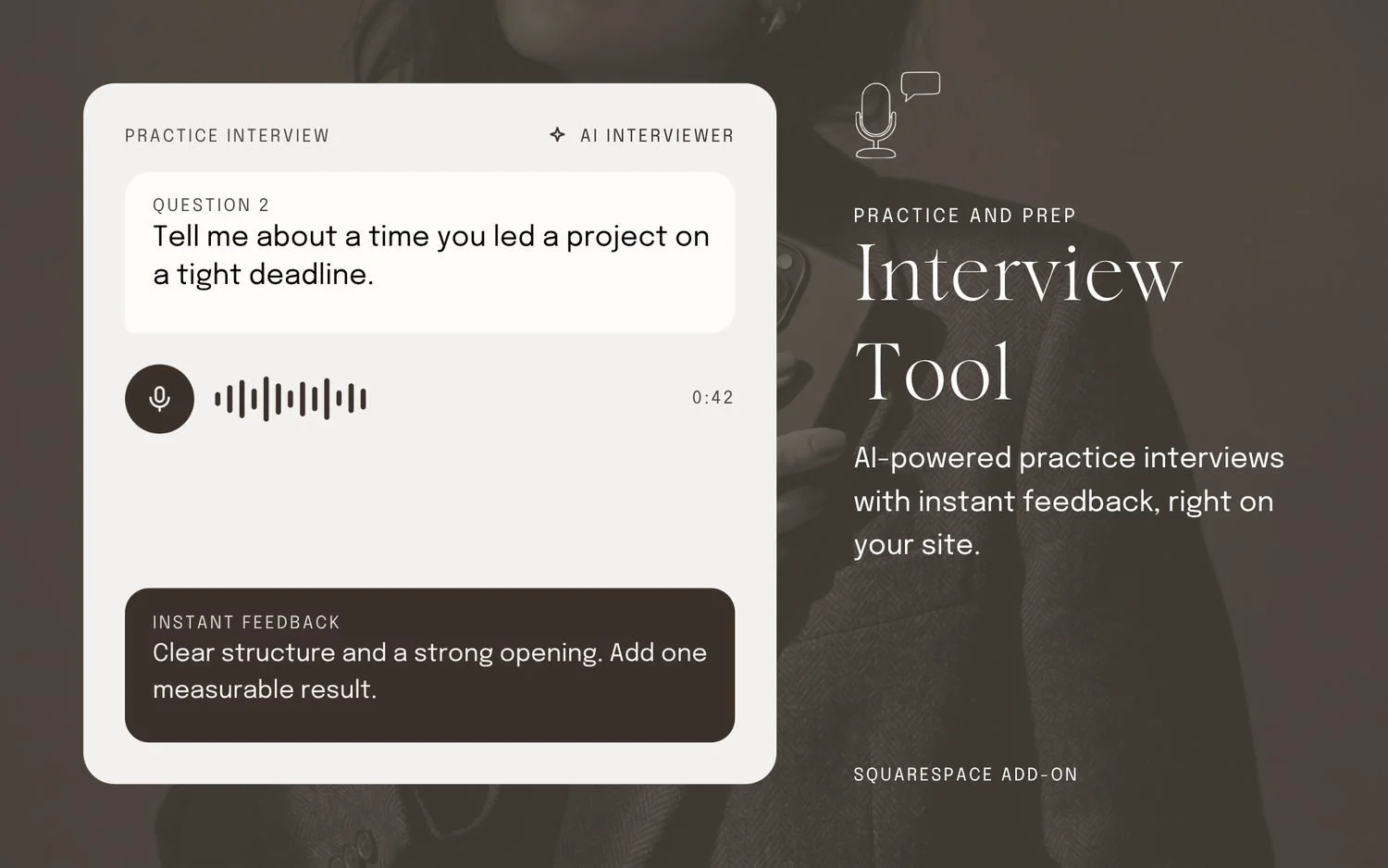
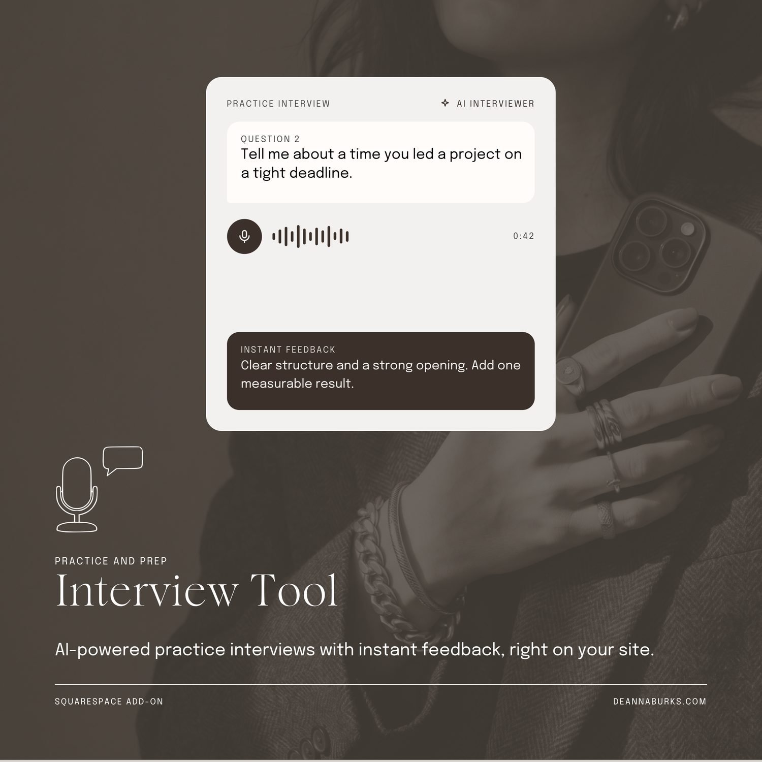
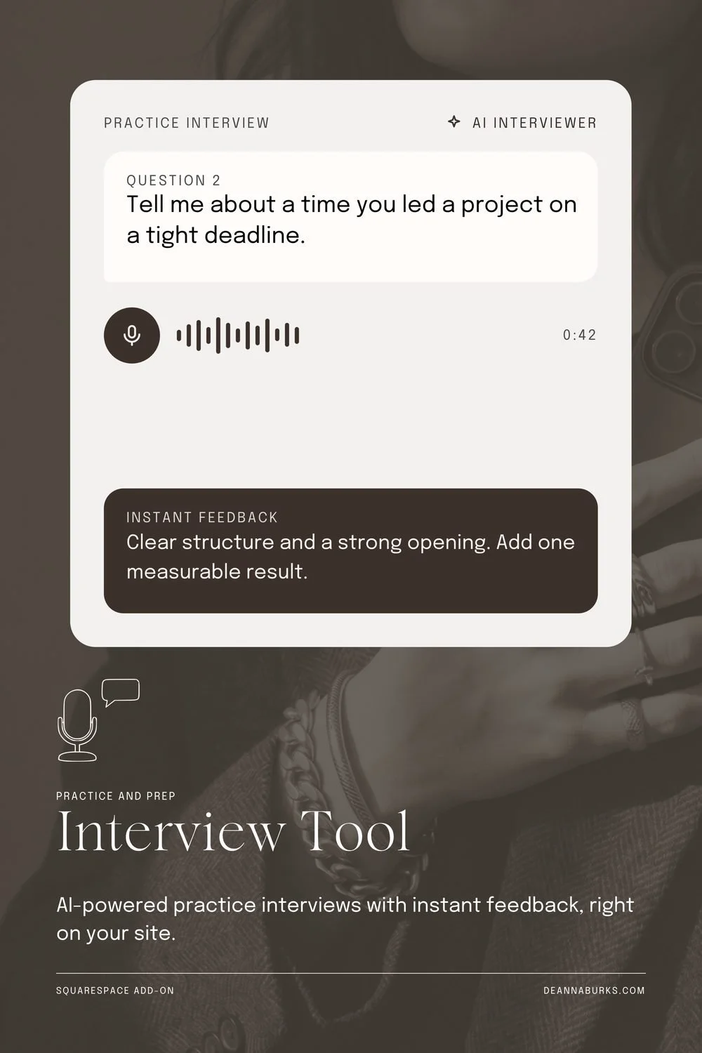
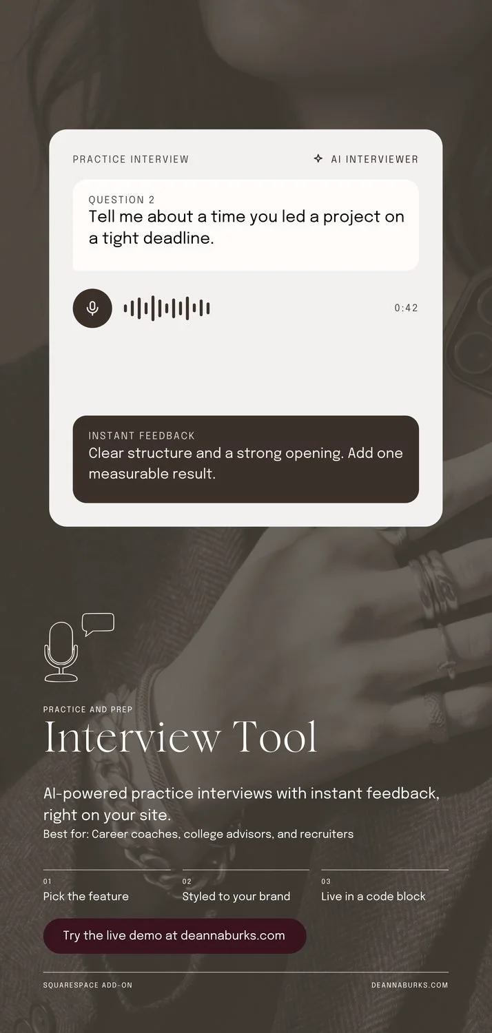
Interview Tool
7/9- Position the left, halfway down
- Empty Space very full
The interview card runs almost the full height, with an empty band inside it. A shorter card will feel lighter.
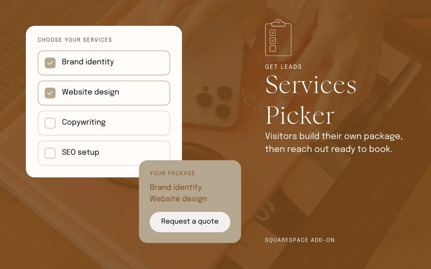
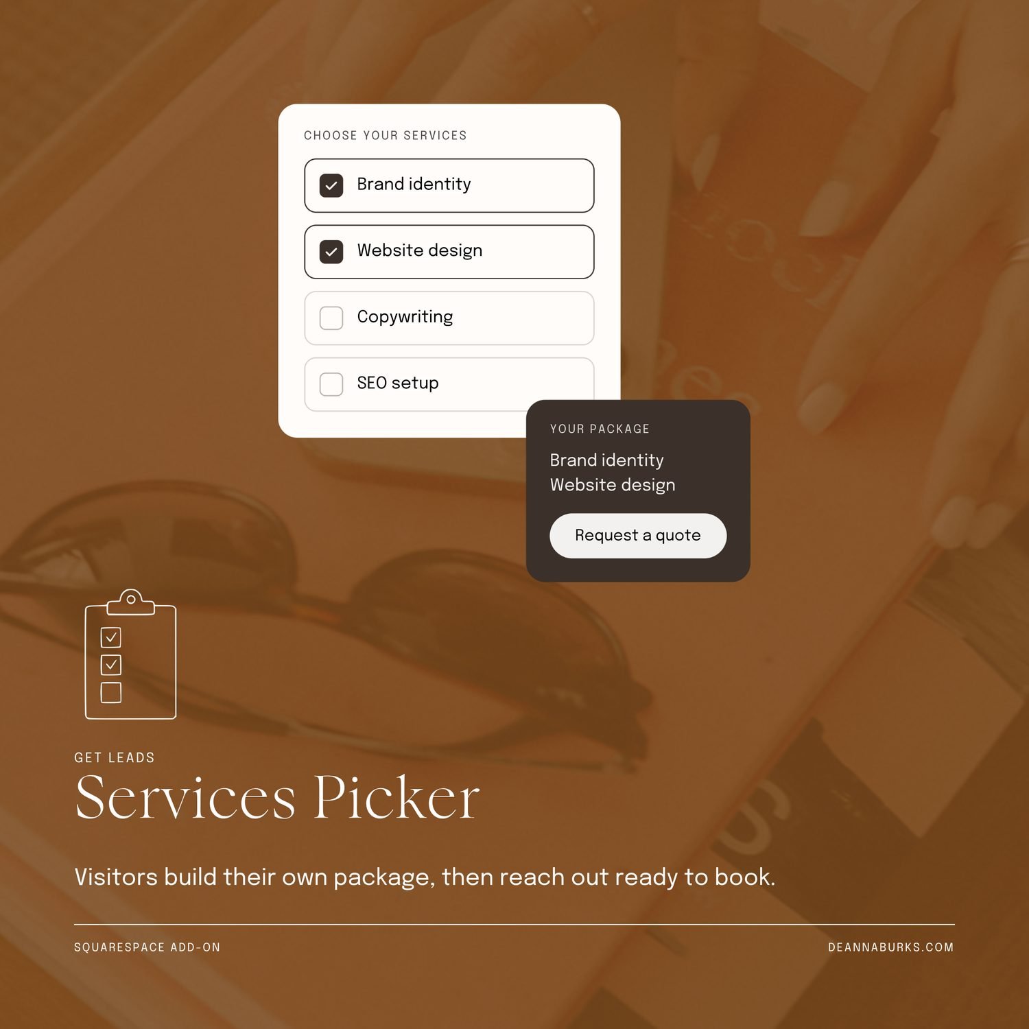
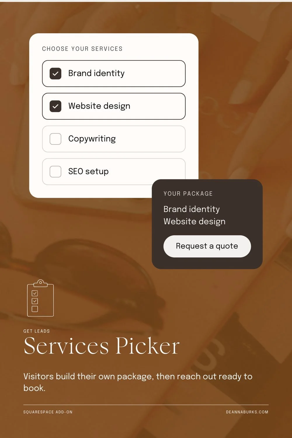
Services Picker
6/9- Position the left, halfway down
- Empty Space very full
- Readability large text only
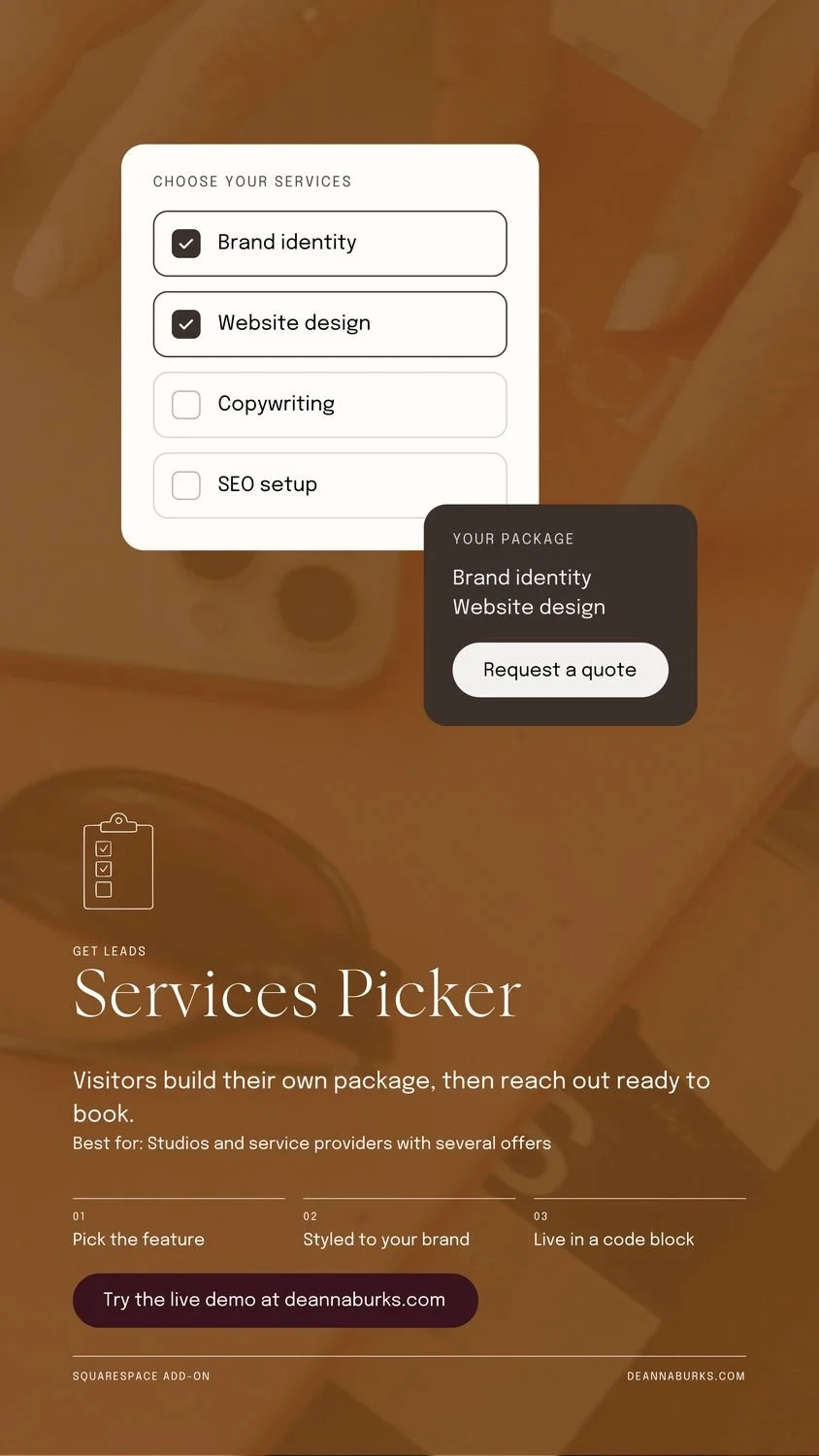
The package card ended up brown text on tan, at 3.1 to 1. That is the one real readability fail in the set. The dark card from the other sizes fixes it.
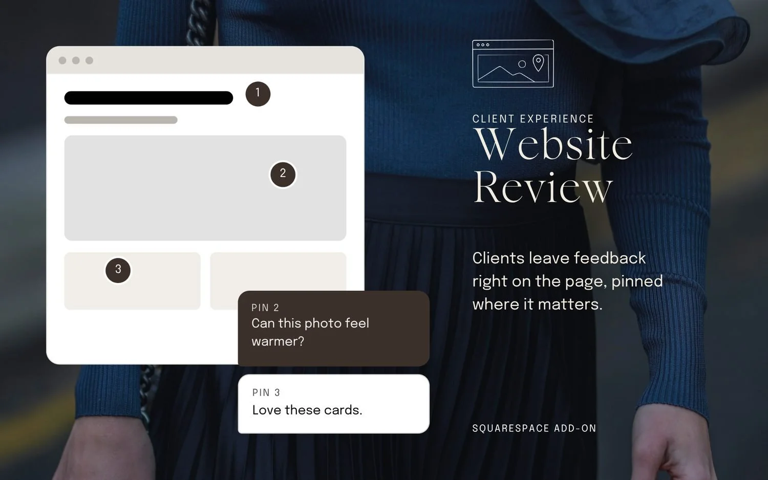
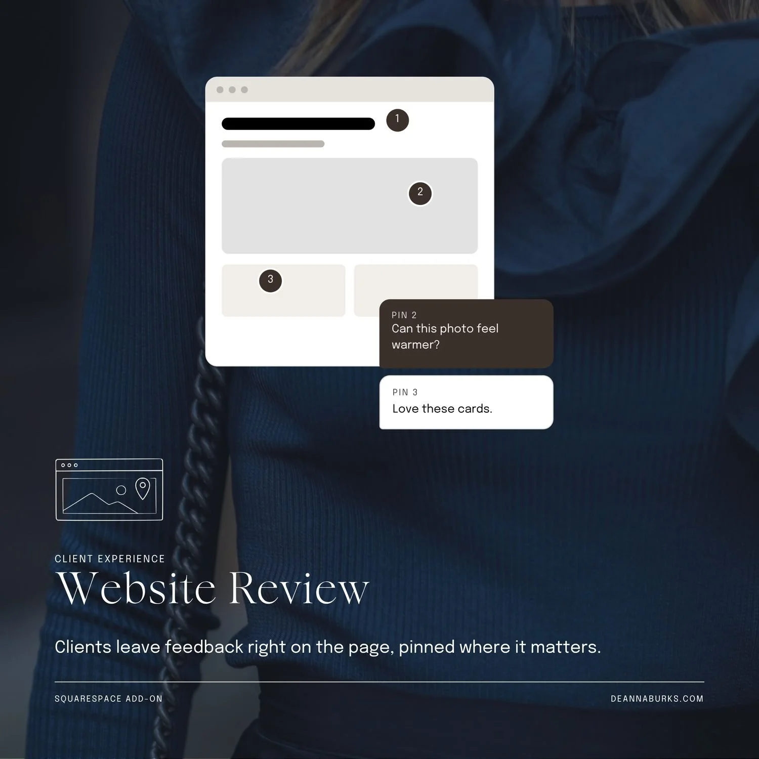
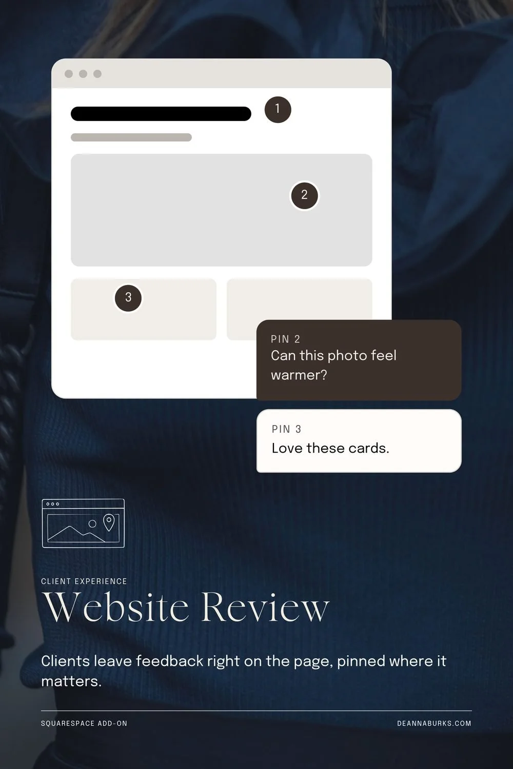
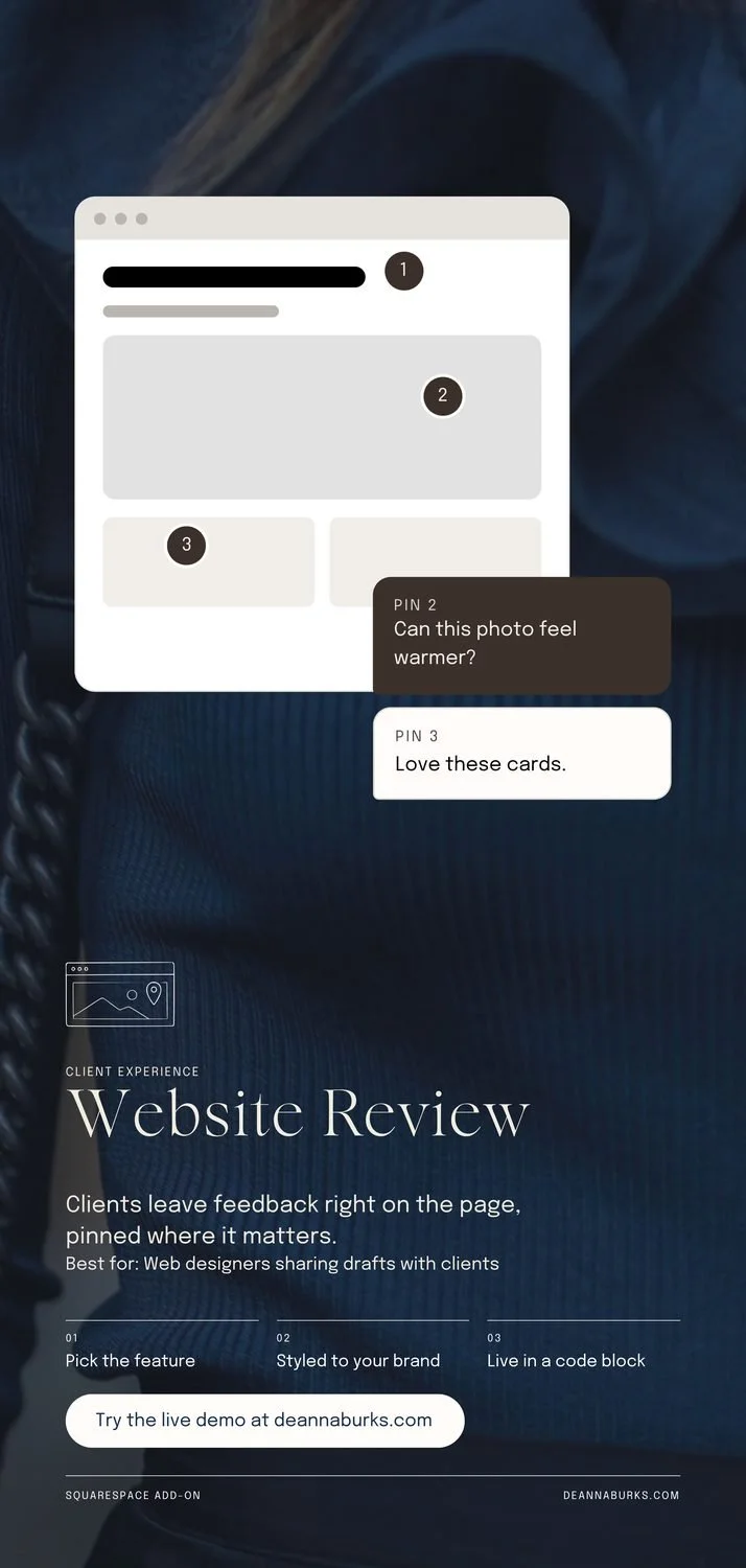
Website Review
7/9- Position the left, halfway down
- Empty Space very full
Clean. The pinned comments overlap the browser card nicely. The knit texture is why the tool calls it full, and it does not hurt the read.
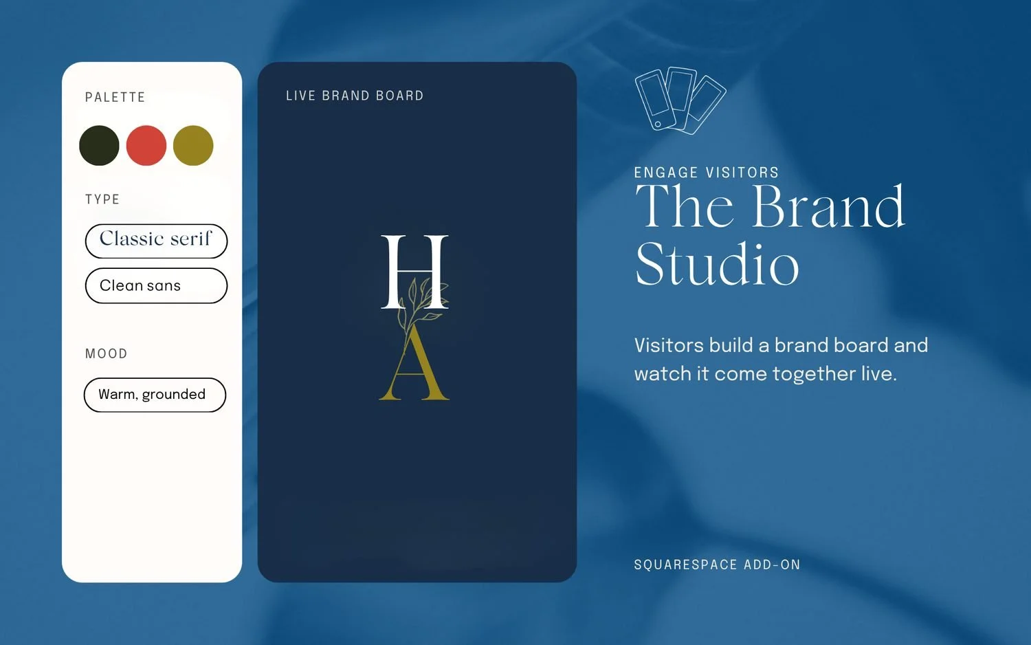
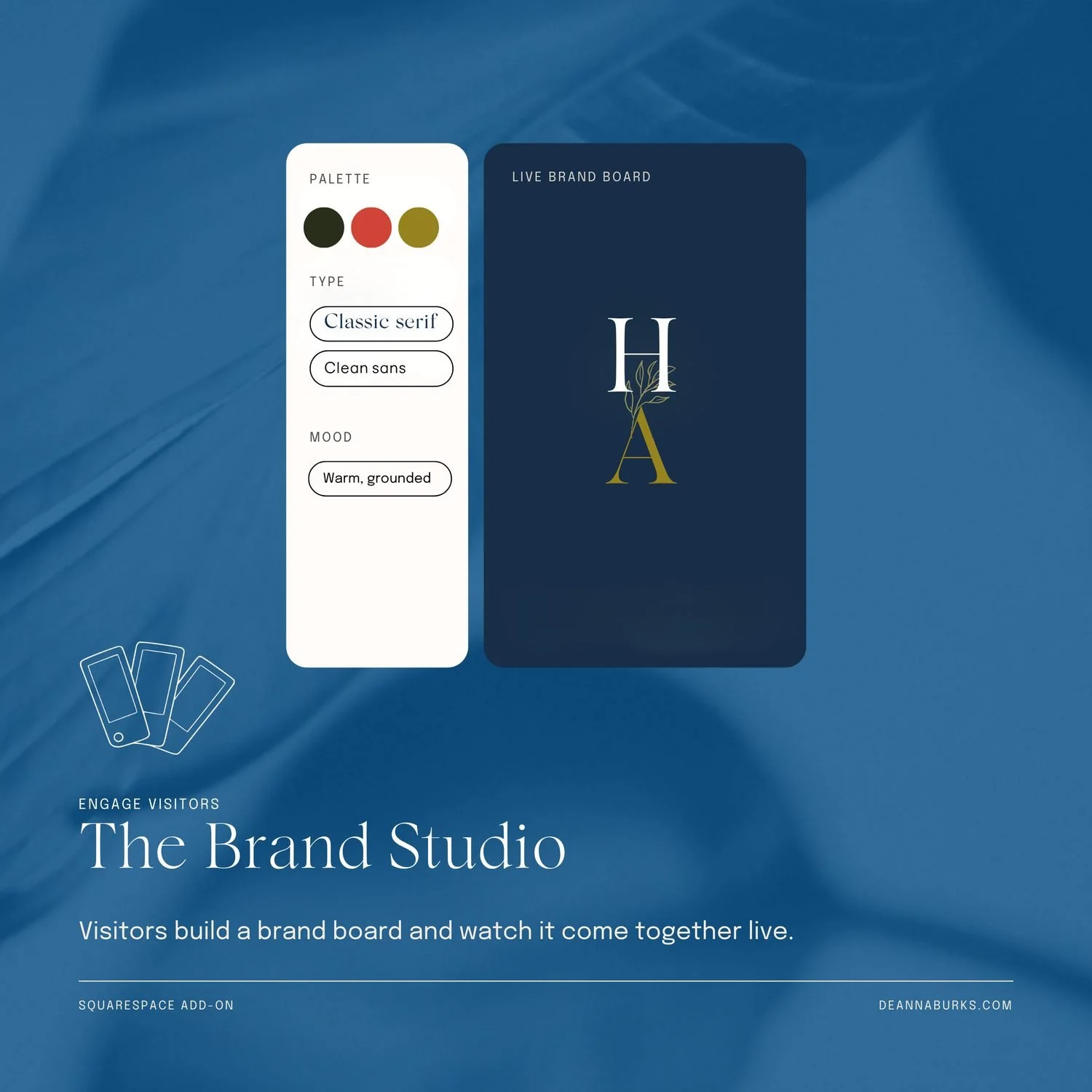
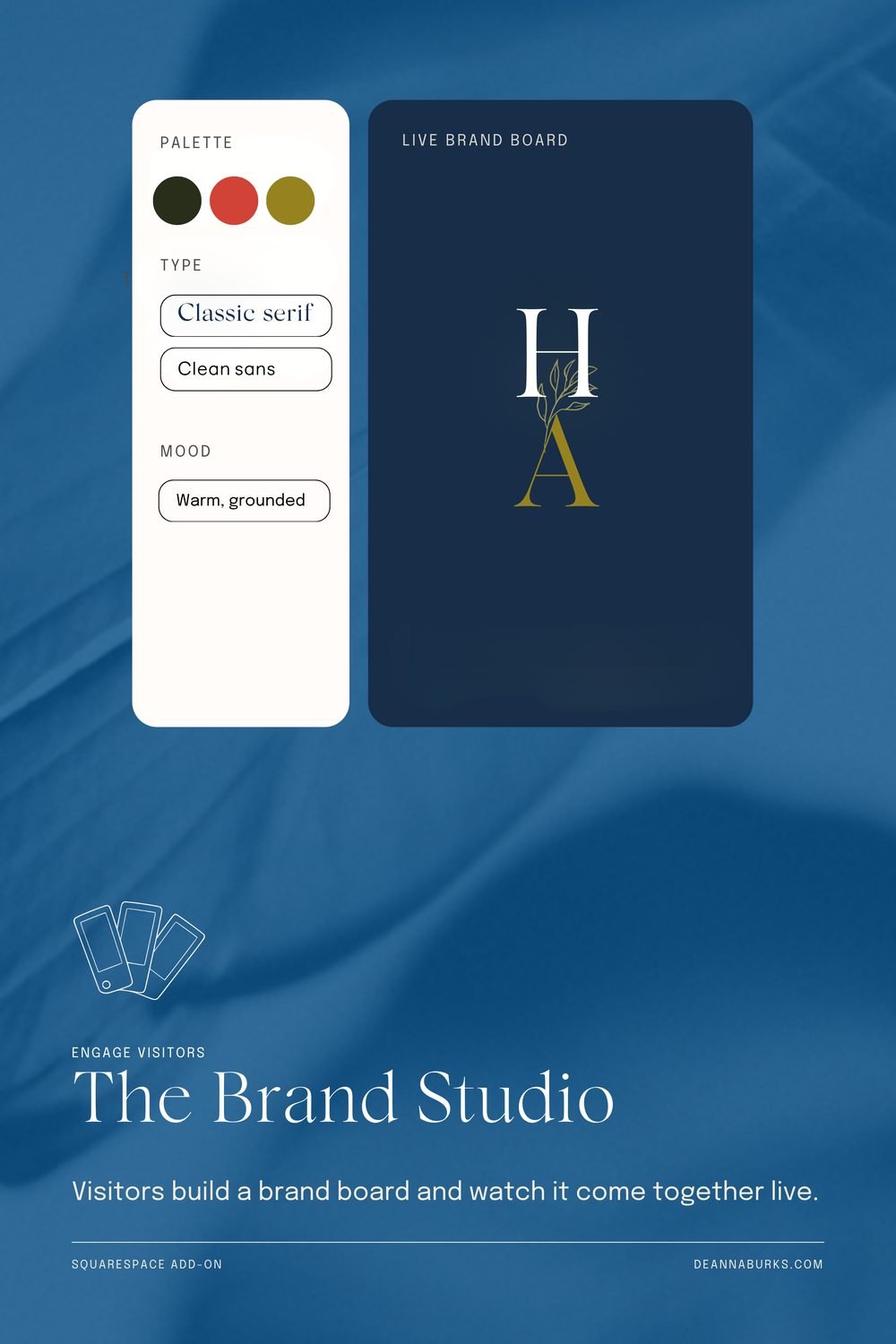
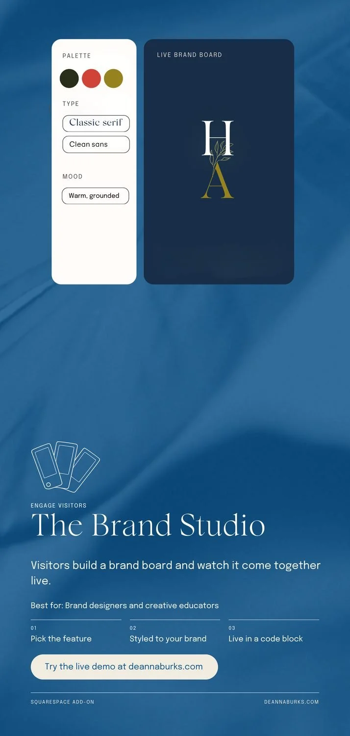
The Brand Studio
7/9- Position the left, halfway down
- Balance nearly even
Calm and easy to read. There is open space under the body copy, which is a good home for my URL.
Composition Check
7/9- Position the top, centred
- Readability large text only
Good. The small text on the beige photo is at 4.2 to 1, so the overlay gets a touch darker.
Brand Combo Spinner
8/9- Balance split down the middle
Strong. The tool calls it split down the middle because the card is centred over full width text. That is normal for a feed post.
Tech Stack Showcase
8/9- Position the top, centred
Strong. Nothing to fix.
Brand Review Page
8/9- Text Sizes 5 sizes
Strong. The extra text sizes come from the tiny concept labels inside the mockup, so I am ignoring that flag.
Interview Tool
8/9- Text Sizes headline too close
Strong. The headline flag is reading the question inside the card, not my real title.
Services Picker
8/9- Position the top, centred
Strong and clear. Nothing to fix.
Website Review
7/9- Position the top, centred
- Text Sizes headline too close
The tool found a rearranged version that scores higher by bringing the browser card down. Worth trying.
The Brand Studio
8/9- Position dead centre
The calmest square in the set. Nothing to fix.
Composition Check
7/9- Position the top left
- Readability large text only
The subhead sits tight under the title here, while every other add-on in this size has a gap.
Brand Combo Spinner
7/9- Readability large text only
- Text Sizes 5 sizes
The hair texture pulls the small footer text down to 4.1 to 1. A slightly darker overlay at the bottom fixes it.
Tech Stack Showcase
7/9- Position the top, centred
- Text Sizes 5 sizes
The tile grid is much bigger than the other mockups in this size. Scaling it down makes the set feel like one family.
Brand Review Page
7/9- Empty Space very full
- Text Sizes 5 sizes
The body copy ends with one word alone on the last line. A small copy tweak fixes it.
Interview Tool
7/9- Empty Space very full
- Text Sizes 5 sizes
The interview card is large with an empty band inside. Shorter card, calmer frame.
Services Picker
8/9- Position the top, centred
One word alone on the last line (book.). Otherwise clean.
Website Review
7/9- Position the top, centred
- Empty Space very full
The last line is two lonely words, and the busy knit photo shows through behind the text.
The Brand Studio
8/9- Position the top left
Good. The mockup lines up with the text margin, which reads as deliberate.
Composition Check
7/9- Position the top left
- Readability large text only
Subhead tight under the title, and an empty band between the mockup and the text.
Brand Combo Spinner
7/9- Position the top, centred
- Text Sizes 5 sizes
The title runs almost to the right edge, with half the margin it has on the left. One size smaller fixes it.
Tech Stack Showcase
7/9- Position the top, centred
- Text Sizes 6 sizes
The Best for line touches the body copy, and the body ends with one word alone (time.).
Brand Review Page
7/9- Position the top, centred
- Text Sizes 5 sizes
The Best for line touches the body copy. Otherwise good.
Interview Tool
7/9- Empty Space very full
- Text Sizes 6 sizes
The Best for line touches the body copy, and the card has an empty band inside.
Services Picker
7/9- Position the top, centred
- Text Sizes 5 sizes
The Best for line touches the body copy. The tool found a higher scoring rearrangement.
Website Review
7/9- Position the top, centred
- Empty Space very full
The Best for line touches the body copy. The busy photo is why it reads as full.
The Brand Studio
6/9- Position the top left
- Empty Space a gap in the middle
- Text Sizes 5 sizes
The lowest pin. About a fifth of the design is one empty block in the middle. The mockup needs to move down or grow.
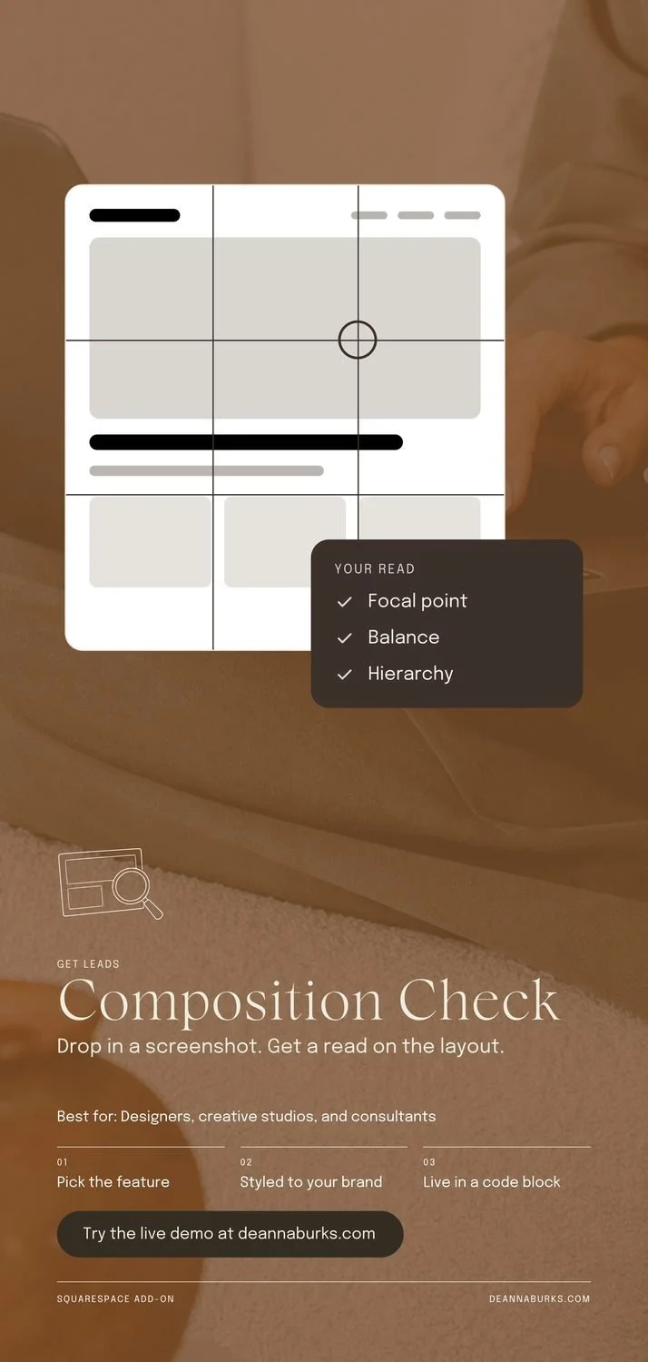
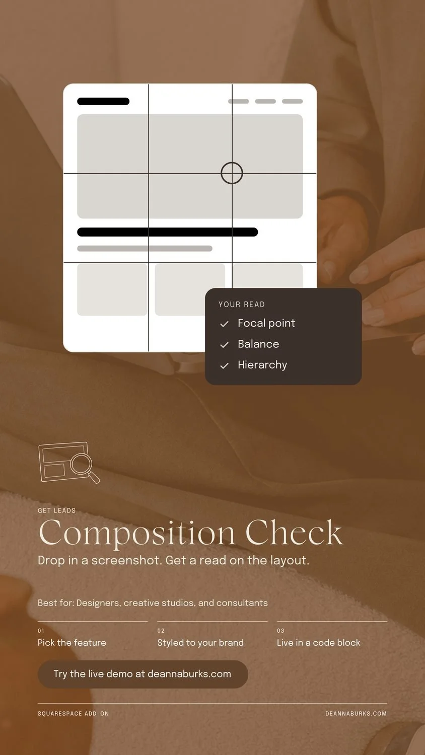
Composition Check
7/9- Position dead centre
- Readability large text only
Subhead tight under the title. The button and footer sit where Instagram's reply bar covers them.
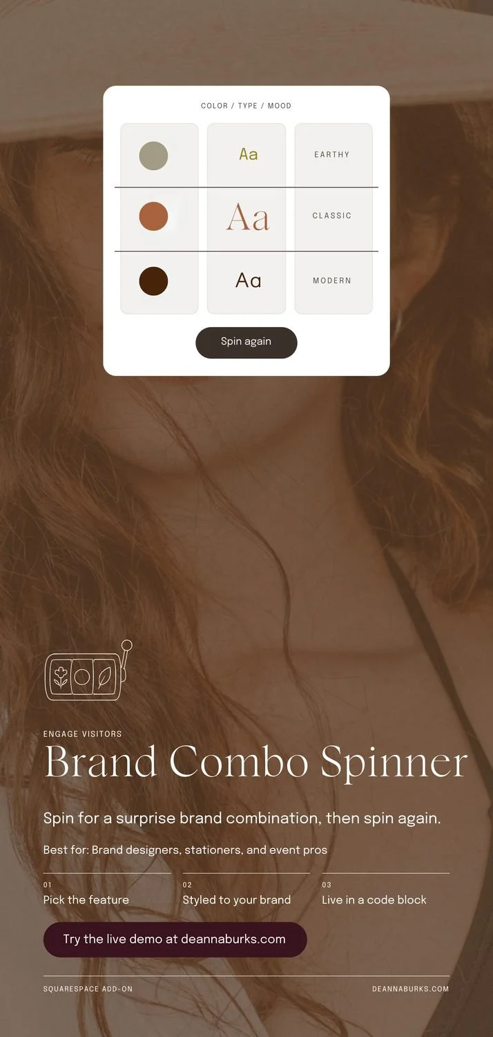
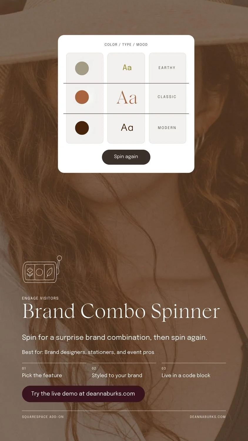
Brand Combo Spinner
8/9- Position the top, centred
Good. The mockup starts very close to the top, where Instagram shows the profile name.
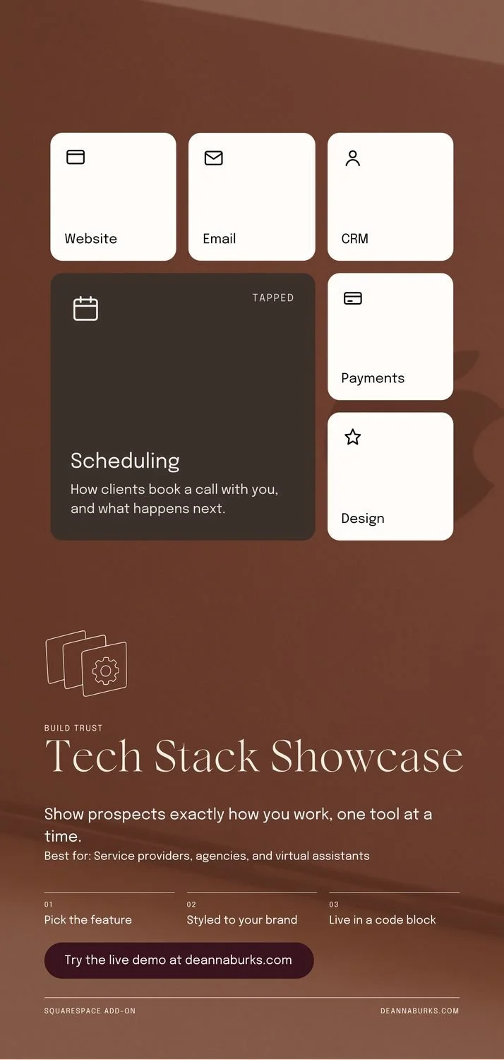
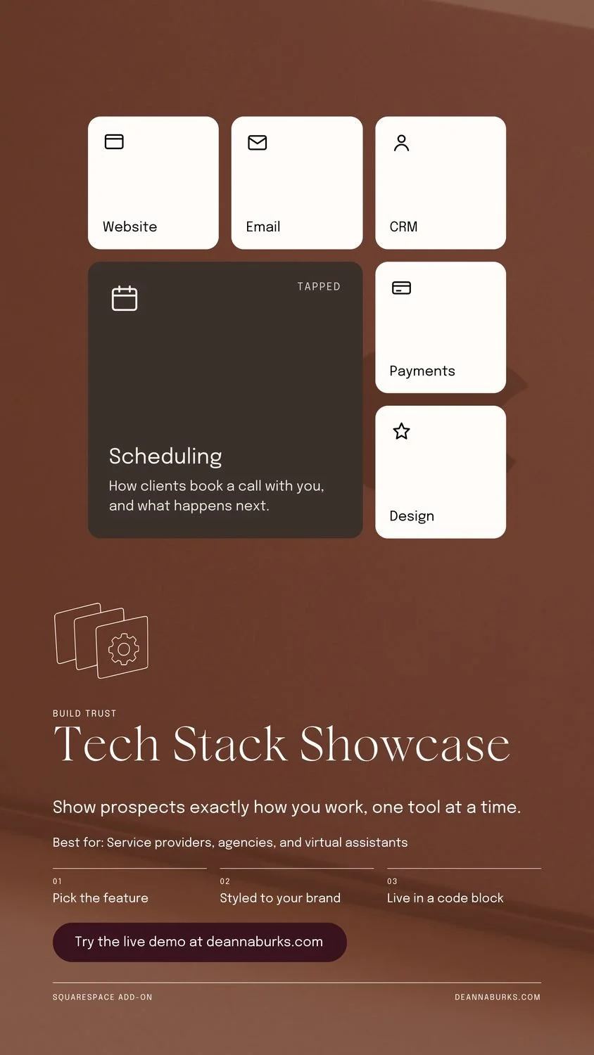
Tech Stack Showcase
7/9- Position the top, centred
- Text Sizes 5 sizes
Good. Same note as the other stories about the button sitting low.
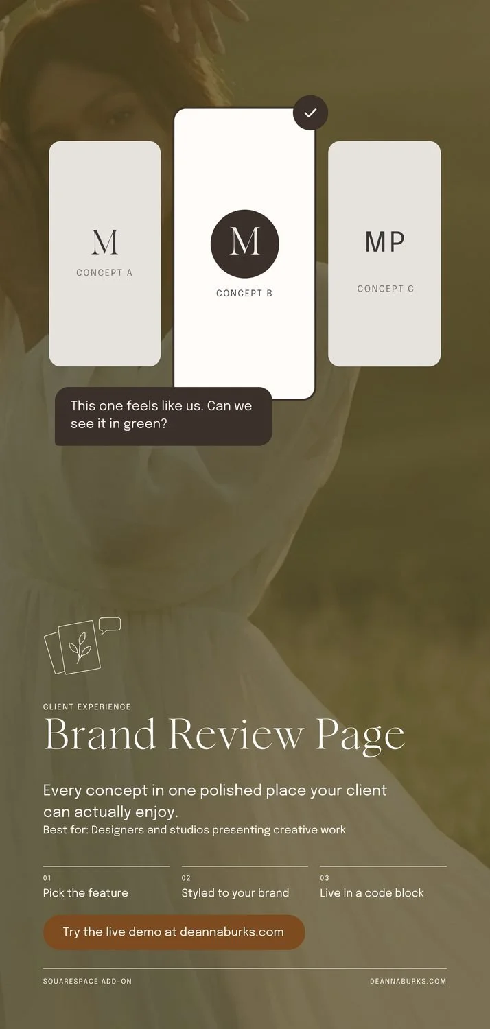
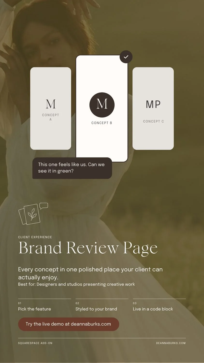
Brand Review Page
8/9- Text Sizes 5 sizes
The Best for line touches the body copy. Otherwise strong.
Interview Tool
6/9- Position the top, centred
- Empty Space very full
- Text Sizes 5 sizes
The Best for line touches the body copy, and the card has an empty band inside.
Services Picker
7/9- Position the top, centred
- Text Sizes 5 sizes
The Best for line touches the body copy, and the body ends with one word alone (book.).
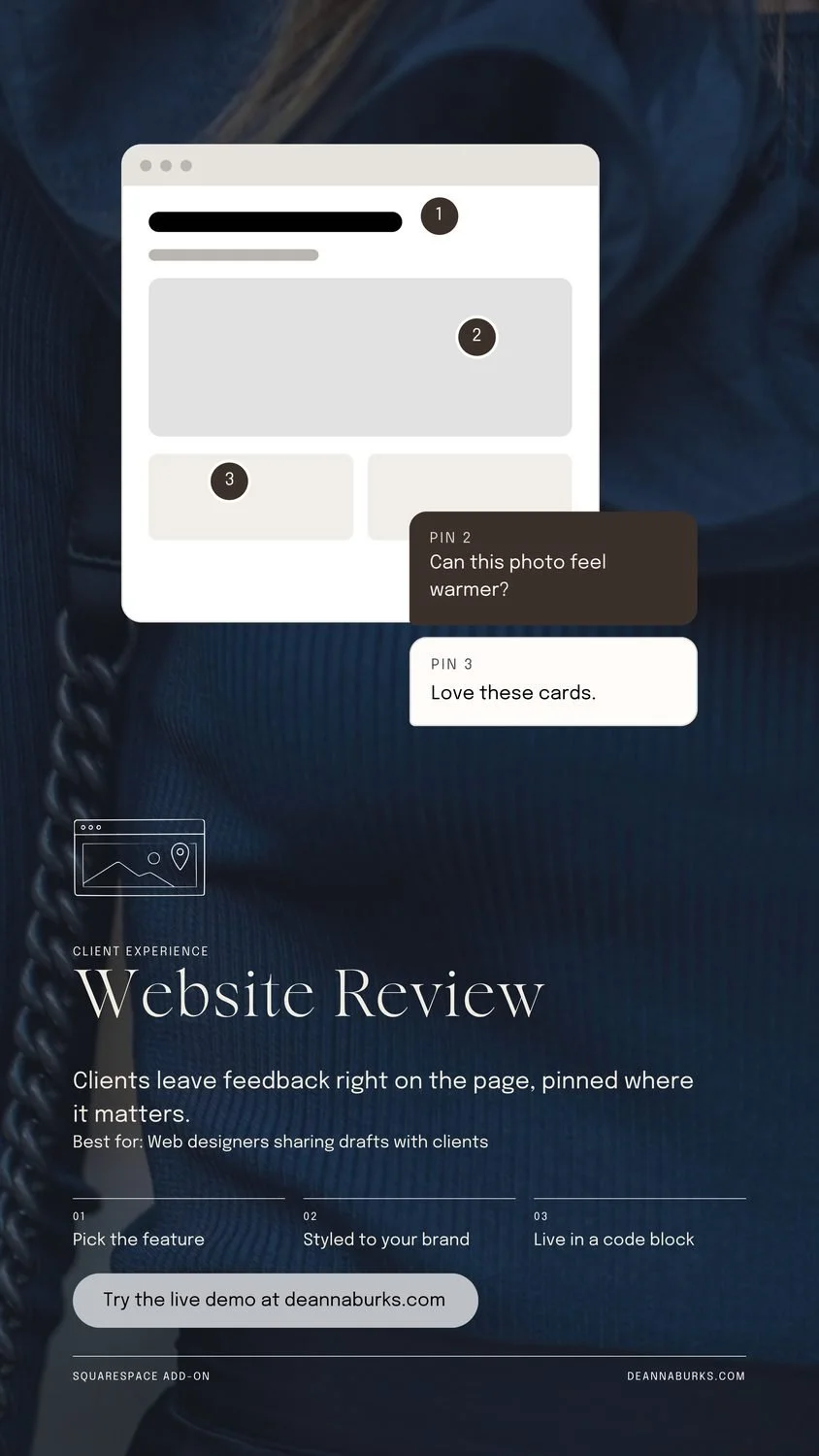
Website Review
6/9- Position the top, centred
- Empty Space very full
- Text Sizes 5 sizes
The button is grey here, which reads as a disabled button. The cream one from the next story fixes it.
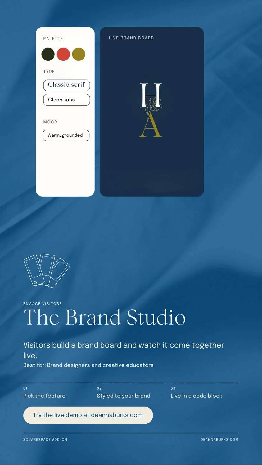
The Brand Studio
7/9- Position the top left
- Text Sizes 5 sizes
The mockup starts right under Instagram's profile bar, and the body ends with one word alone (live.).
Check your own design
Drop in a screenshot of your website, post, flyer or logo and get the same read in plain words. Your first check is free.
Try the Composition CheckWant a designer's eyes on a whole set? Book a brand and web review.